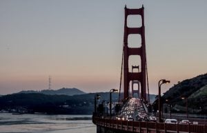
After working with EDF and partners to map hyperlocal pollution in Oakland, CA using Google Street View vehicles, researchers Dr. Joshua Apte (University of California, Berkeley) and Dr. Sarah Chambliss (University of Texas at Austin) collected additional mobile data across the San Francisco Bay Area to expand understanding of street-level air quality and disparities in pollution exposure. Their new paper, “Local- and regional-scale racial and ethnic disparities in air pollution determined by long-term mobile monitoring” was published in September in the Proceedings of the National Academies of Sciences. It builds on previous work in Oakland published by Dr. Apte in 2017. I recently spoke with Dr. Chambliss about the latest findings.
What were the key findings of this new research?
Dr. Chambliss: In this study, we broadened the geographic scope of our mobile pollution measurements beyond Oakland to neighborhoods across the Bay Area. Throughout the other areas we drove across the SF Bay Area, we saw some of the same types of patterns that we originally described in the original Oakland study: steep increases in concentrations near major roads (especially for nitric oxide, or NO) and some additional localized peaks that could be attributable to other localized sources that we are still working to identify.
We also saw evidence that the types of sources contributing to local pollution differ among study areas: some areas have more prominent peaks for black carbon, others for NO. The mix of pollution is different in different areas around the Bay. We saw that some neighborhoods were much cleaner than others, and some neighborhoods had higher levels of some pollutants but were not higher for every pollutant. Because we had looked at so many different types of neighborhoods, we saw an opportunity to extend the Oakland analysis by also asking: Who lives in the neighborhoods that are more polluted, and how do pollution patterns compare to or interact with patterns of racial/ethnic segregation that persist in the Bay Area?
After connecting the street-level air pollution data with census data, we found that there were systematic differences in pollution exposure across racial/ethnic groups. Specifically, Black and Hispanic/Latino people had 10-30% higher average exposure to NO, nitrogen dioxide (NO2) and ultrafine particles (UFP) than the population as a whole, while white non-Hispanic residents had 20-30% lower average exposure. The neighborhoods where we measured the cleanest air tended to have higher proportions of white residents, as well. In contrast, neighborhoods where more people of color lived tended to have higher concentrations not just near roadways but in areas of the neighborhood we would consider “background” locations: residential areas where we expect conditions to be cleaner.
Why do these disparities in air pollution exposure matter?
Dr. Chambliss: Air pollution can have major short-term and long-term health impacts. Studies have shown linkages among the group of pollutants we looked at–NO and nitrogen dioxide (NO2), black carbon, and ultrafine particles- with hospital visits, chronic lung and heart disease, with particular risks for the health of newborns and the elderly.
Because air pollution causes systemic inflammation, its impacts spread far beyond the lungs: there is evidence of air pollution affecting cognitive development and diabetes prevalence, for example. Those exposed to higher air pollution are at higher risk of a wide range of health problems. When disparities fall along lines of socioeconomic status or other social vulnerabilities, the health risks caused by air pollution can compound with issues like lower access to medical care or less capacity to handle the financial burden of health issues.
How did you collect such detailed street-level pollution data?
Dr. Chambliss: We had several partnerships that allowed us to achieve this level of coverage. A partnership with Google Earth Outreach allowed us to use Google Street View vehicles to drive “blackout” patterns, where we drove down every road in a study area each time we visited. We also partnered with Aclima, Inc., who installed laboratory-grade instrumentation in these cars and kept the equipment maintained and calibrated for near-daily driving.
We drove two of these “mobile laboratories” nearly every weekday over a 32-month period, visiting different neighborhoods each day and revisiting each neighborhood every 6 weeks or so to collect measurements representing different seasonal conditions.
What kind of policy implications do you see for this work?
Dr. Chambliss: That there are higher pollution levels in neighborhoods with more people of color isn’t a new finding in and of itself, but the level of spatial detail that we could bring to this analysis provided some additional insights. Often, within one neighborhood or several adjoining neighborhoods, there is a wide range in the outdoor pollution levels at different addresses. And these differences do not typically lie along racial/ethnic lines. It’s only when you zoom out to look at city-wide patterns of segregation that you see racial/ethnic disparity in exposures. This is strongly influenced by neighborhoods where the lowest levels of pollutants like NO2 and UFP are higher than even peak levels in cleaner neighborhoods.
This gives us an indication of how policies could be improved to geographically target pollution mitigations to better address disparity and promote environmental justice. Look specifically at communities where the baseline pollution levels are higher and where residents are predominantly people of color. This segregation is often connected with historically racist policies such as discriminatory lending policies or racial covenants built into housing deeds. While those policies may have ended, they leave a persistent legacy placing communities of people of color in areas with higher pollution and greater environmental health risks. To help reverse these patterns of environmental injustice, it’s critical to work to clean up the air pollution sources within those neighborhoods.
What does work like this mean for the future of hyperlocal air pollution monitoring?
Dr. Chambliss: An implication of how localized some pollutant peaks are – a phenomenon that mobile monitoring is particularly suited to measure – is that when you cut emissions from a particular source or type of source, you will see major benefits very close to that source but more moderate reductions everywhere else. If you want to evaluate the full benefits of such a policy, making measurements with fuller spatial coverage may show a magnitude of improvement that wouldn’t be reflected at a single fixed monitoring site. For example, anti-idling policies would help specifically at locations with a lot of truck activity, like ports or warehouses, but it may not be obvious from the outset where the most idling occurs. Mobile monitoring is a way to find those areas that really benefit.
Another thing this research shows is how important it is to spread out measurements over a broader geography as much as possible, given time and resource constraints. It would be great to do a similar study in another US city, because each one has a unique history of growth, industrialization and zoning, and segregation or discriminatory housing policies. It would also be interesting to look at cities outside of the US where urban development patterns, both demographic and land-use related, are much different.
What’s next for you in this field?
Dr. Chambliss: We are continuing to work with these mobile monitoring data to gather further insight into what features of the urban environment lead to pollution hot spots.